
Blog Post: Savvy Sisters Studio
Location: Perry, Georgia, USA
I am sorry for the long silence - work and my private life have been very demanding. Sometimes life really gets in the way of my blogging; I know most of you understand!
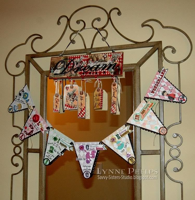
I hope you will indulge me as I kick off the 2011 posts here on The Altered Alice by showing off one of my own creations. I don't know if I have mentioned it before, but all of the artwork that you see in the blog margins and the blog header are snippets from my own Alice creations that have been featured on my personal blog, Savvy Sisters Studio. I had such fun creating the graphic elements for this blog! But the piece I am sharing with you today is a different one - my tagged Alice wall sign.
Take a look, and remember you can click on any photo to see it larger:


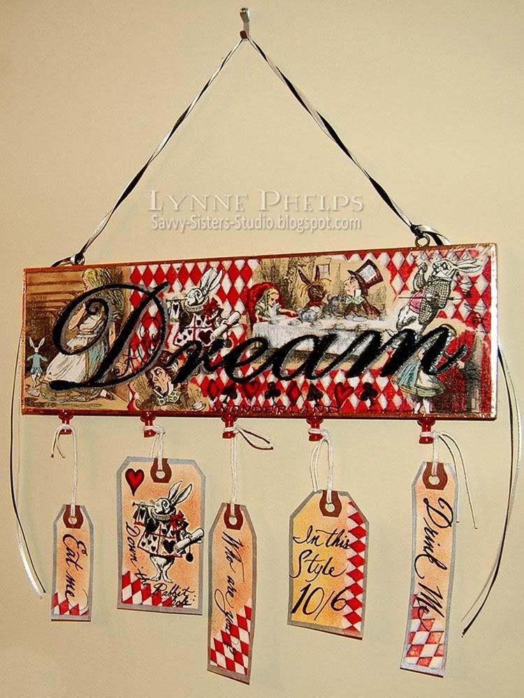
Then I carefully masked all the stamping and filled in with the red diamond background.
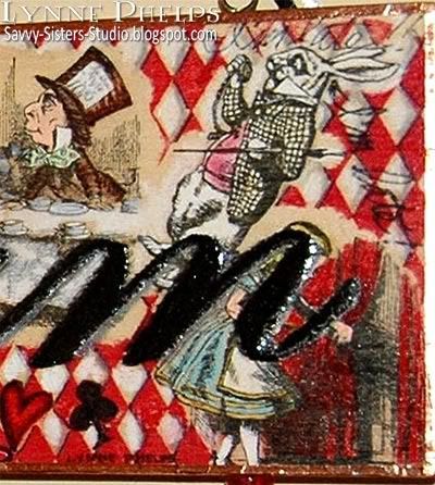
It is hard to see, but I scribbled "I'm late! I'm late!" around the White Rabbit. I wrapped the edges of the sign with copper foil tape to give it a more finished look.
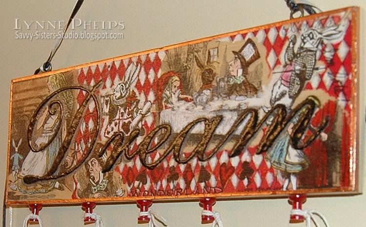
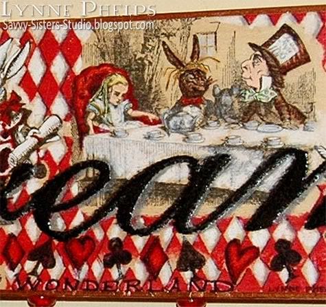
I took a silver paint pen and added a shadow to one side of all the "Dream" letters. Then I carefully filled in each black letter with a Versamark pen and heat embossed with UTEE (ultra thick embossing powder) in black. I did this about three times to really give the letters a lot of depth. I think you might be able to see it better in this picture, where you can also see that I clear coated the whole sign with a spray sealer:

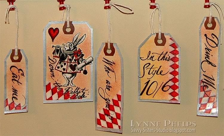
I followed a lot of the same steps for the manilla shipping tags, which I tied onto red push-pins that I stuck into the wood along the bottom of the sign. I tried to imitate the handwriting that appears on the Mad Hatter's hat in the original Tenniel illustrations:
This sign hangs from my "Alice Looking Glass" in the foyer of my home, which is festooned with other Alice creations!
One last look at the whole thing. I can't tell you how much I love this sign. Gosh, it is SO much better looking in real life!
It is hard for me to give an unbiased review but I will try to talk about why I think this piece works: I think I can sum it up in one word - balance!
First, the wooden sign was extremely horizonal. Adding the tags in various sizes and hung at different heights really helps this piece to break out of the rectangle. Adding the long black and white twisted ribbon hanger at the top balances the space occupied at the bottom by the tags. By adding the elements above and below, the wooden Dream sign now occupies the center of the visual space taken up by the piece.
Another thing that I think works well is the mix of scales. Because the Dream word is so bold, the images and the diamond background do not overwhelm it. The big boldness of the word is balanced by the smaller-scale detail of the illustration and diamonds. The largest letter, D, is anchored by the largest illustration at the left. This image almost makes the D like an illuminated drop cap like you see in old books, where the first letter of a chapter is larger and ornamented. The swash of the D entwines around the kneeling figure of Alice, helping to integrate the word with the images.
There is also a good balance of bright colors versus neutrals. The images in the sign are overall neutral as the natural wood can be seen through the Prismacolor pencils, which really mutes the colors. The black and silver of the Dream word are neutral colors. The sign was actually very muted until I added the bright red and white diamonds. The tags show the same balance of plain vs. patterned background. The tags do not add any additional colors into the mix, being only black, red and white plus the sponged background, which allows the colored images on the wood sign to seem richer and more vibrant in contrast.
It is hard for me to be objective about my own work, so I hope you will leave a comment and tell me what is is that YOU like about this piece, or even what you don't! I would love to hear YOUR critique on my Alice Dream Sign!

Lynne -
ReplyDeleteThis is gorgeous! It speaks to me, your balance of the red, even using the red in your push pins is wonderful. It just says fun when you first look at it. Then it seems to call you to look a little closer. Your use of the tan colors help ground the whole piece. I am so loving this - beautiful work!!
Elaine Allen
O M G lynne, what can I say ????
ReplyDeleteI´m overwhelmed. So wonderful piece with amazing colors. The red is brilliant. I´m love all the little details. Wow wow wow.
Like the two previous comments I like the red diamonds you have used. The fact that you have used them randomly on the tags gives it even more balance.
ReplyDeleteI love how you have emphasised the lettering with utee and then shadowed the letters with silver. All in all it is a wonderful piece of artwork which would enhance anyones home and I am glad I am holidaying in America because I might just have to take a trip to Walmart (if you don't mind). Love the stamps you have used - would you mind sharing whose they are as I am sure the images are larger than the ones I have.
I edited the post to add that I bought the sign several years ago and it was added to stash. I am not sure if it is still available and I know my Wal-Mart has cut way back on craft supplies.
ReplyDeleteI also added that the stamps are by Nature's Blessing. They have a fine collection of antiquarian stamps, and you can see their Alice stamps HERE. Mine are all wood mounted, but now you have a choice of wood mounted, cushion mounted, or unmounted.
I love it! I wouldn't change a thing.
ReplyDeleteWhat a wonderful piece, I enjoy'd looking at it, so thanks for showing itt to us.
ReplyDeleteIt is gorgeous.
Lynne, I don't know what to say except that this is one of the most amazing work of arts I have had the pleasure of laying my eyes on. OMG!!! Everything about it is amazing. I LOVE Alice In Wonderland and girl you sure did Wonderland proud:) If I had to break it down into sections I would have to say that my favorite part is where the D is. I love the way you stamped Alice off to the side of the D. I think is was the perfect spot for that particular stamp. I could sit here and comment on every single detail but we would wind up with a REALLY long post. I will tell you that if I saw that for sale, I would buy it right up, and I would be willing to spend a significant amount of money for it!
ReplyDeleteStephanie
what a wonderful way to greet yourself coming and going, always in wonderland. Beautiful colors, design, it will bring smile upon smile. Sandi
ReplyDeleteHoly smokes! What detail and what a tremendous amount of work went into this piece of art. You surprised me by saying you carefully masked off the Dream word. The work that went into it is shocking. Look at those diamonds. Totally fabulous work, once again.
ReplyDeleteFabulous piece, Lynne. Every detail on this piece is obviously thought out. The red and white diamonds link all the pieces. The images you used are perfectly placed. Every detail tells part of the story. You know I am one of your biggest fans, and this piece is a perfect example of why.
ReplyDeleteBy the way, you HAD to introduce me to a new source of Alice stamps. Does this make us even?
I love, love this piece. It's beautiful! Thanks for a new souce for Alice stamps!
ReplyDeleteWhat a wonderful blog!
ReplyDeleteI love all things Alice!
What a gorgeous creation! I love all the stamping you did and the tags at the bottom!
ReplyDelete